ROQ
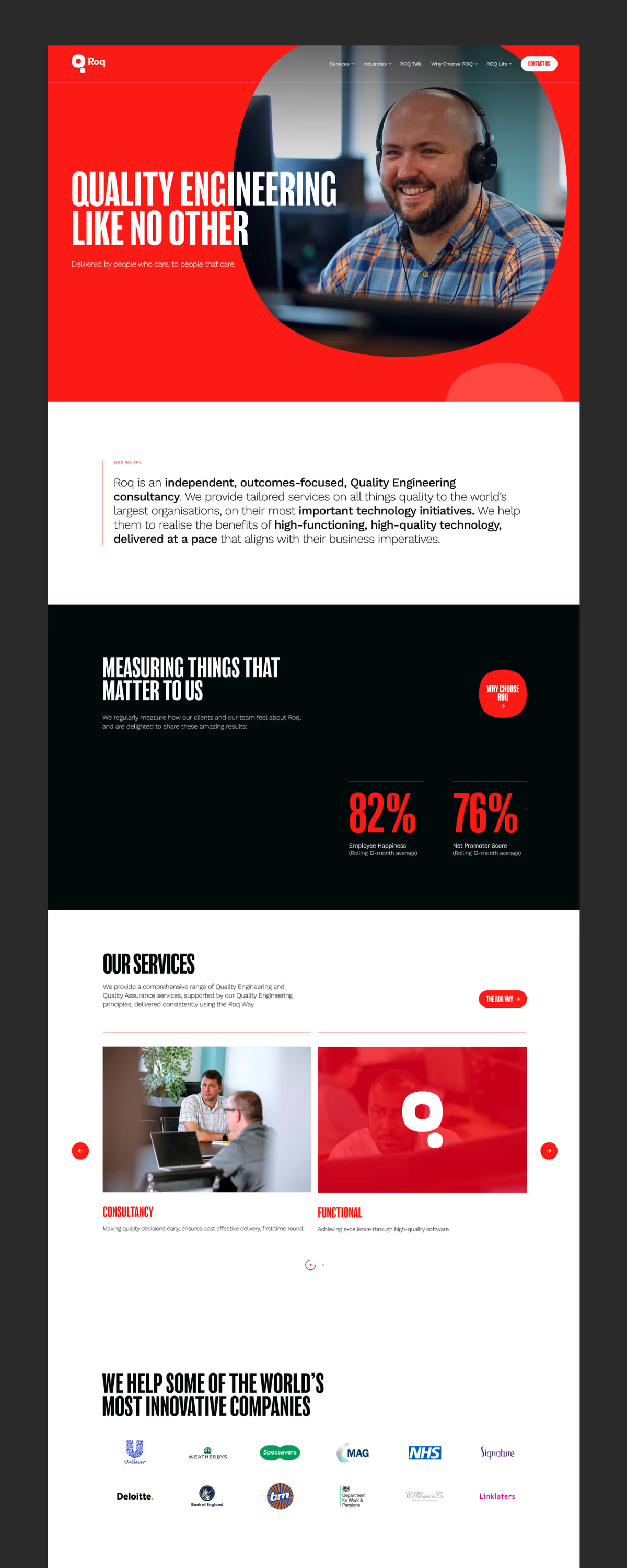
Since 2009, Roq has been assisting organizations in getting the most out of well-performing and top-notch software applications. They make sure these applications are developed at a speed that matches the business goals. As Roq’s business was growing fast, they wanted to make their brand more visible. They asked us to update their brand, and a new website was a big part of this update.
Visit the websiteThe challenge
Roq is a company that gives expert advice on quality to really big organizations. They want their brand and website to show that they provide high-quality services and that they’re doing well with their plans for the next few years. They want their brand and website to be helpful for teaching, good for showing off their brand, and useful for getting new people interested in working with them. They want their brand and website to show that they’re a big company.
Since Roq is all about the people, their new brand and website should also show that they care about everyone and have strong values. This is important to get new employees interested in working there and to show that it’s a great company to work for. Another business suggested that Roq should talk to us, so they did, knowing that they would get good help.
The solution
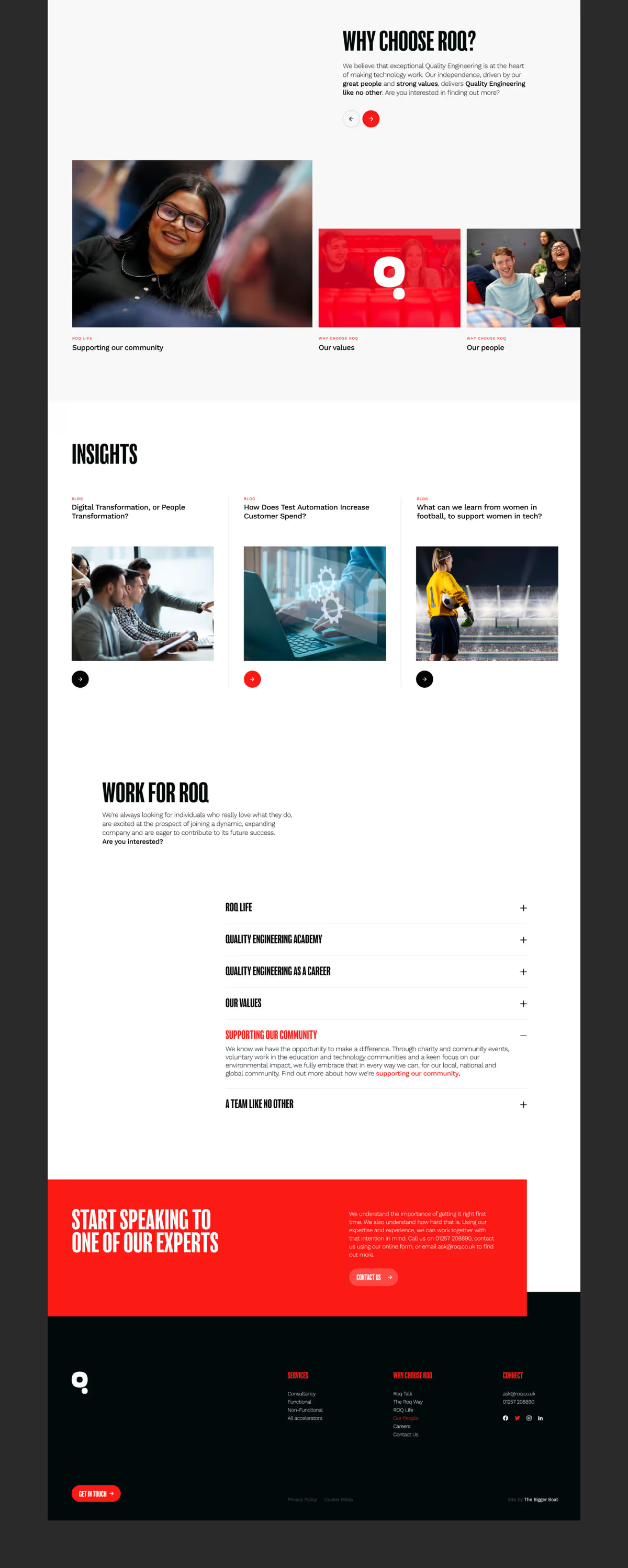
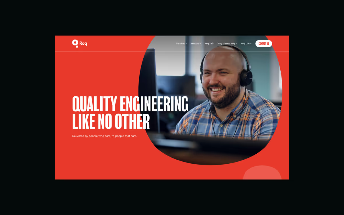
To guide Roq in reaching its goals, we at The Bigger Boat organized a workshop to work on the brand and looked through all the content. Something really important that came out of this was to put Roq’s people front and center in the brand. We spent a day at Roq HQ, taking pictures of the team doing their work to show that real people with real personalities are part of the brand.
From all of this, we got a clear idea of what Roq’s brand is like - its personality, values, and why it exists. This helped us make the brand look different and come up with how it sounds when it talks (tone of voice). We also made guides that show how the brand should be used in things like content and how it talks to people. It’s supposed to sound like someone who knows what they’re talking about but is also friendly and not too formal.
Roq’s new brand is more than just a name. The Q symbol stands for quality, which is super important to them. It shows how Roq becomes a natural part of the businesses they help, understanding what those businesses need. We also changed Roq’s colors to be more exciting and lively.
So what happened? The brand changed and there’s a new website that matches Roq’s plans for growing over the next 10 years. This new look was used on everything from marketing resources to presentations, icons, and a whitepaper. Because of the new brand, Roq stands out from other companies like it, but it still shows what it believes in and what it is, no matter where you see it.
